A Definition of White Space: What It Is and How to Use It

“Let’s make sure we have enough white space so that the user can read this clearly!” Sound familiar? On any given project, you might have heard designers use terms and phrases to describe a particular layout or element of a product. “White space” is one such term, and it has a huge impact on how we perceive and experience a piece of work.
Design principles and design elements
Before we get into the specifics of white space, it’s important to understand that within design, there are design principles and there are design elements. Design elements are the building blocks of what we see on a page. Shape, form, line, texture, color, movement, and space all build what we see and experience. Just like the chef in the kitchen, these are the ingredients of a dish. Design principles are the underlying goals for how we use those design elements. When considering these principles they bring a sense of unity, balance, hierarchy, contrast, emphasis, scale, repetition, which impacts the aesthetic and performance of a page. So, much like the design elements are the ingredients, the design principles act as the flavor notes.
What is white space?
So first, what is white space? White space is a design element used to describe the space between and around objects. Contrary to its title, the space being indicated is not always literally white, but focuses more on the idea of empty space, also known as negative space. It can also vary in proportion and size. In the context of web design, we might be familiar with larger types of white space that can exist around major layout elements. This is typical in large margin spaces on the left and right sides of most websites, or between large content blocks and sections. In addition, white space is present in smaller elements, and can come in the form of line spacing between paragraphs, text spacing, borders, margin and padding in buttons.
What does white space do?
White space can have a huge impact on both the aesthetic and performance of a website. It can add beauty and functionality to your product and brand, and when used correctly, it can be the differentiator between a high-quality and low-quality design.
Clarity and focus
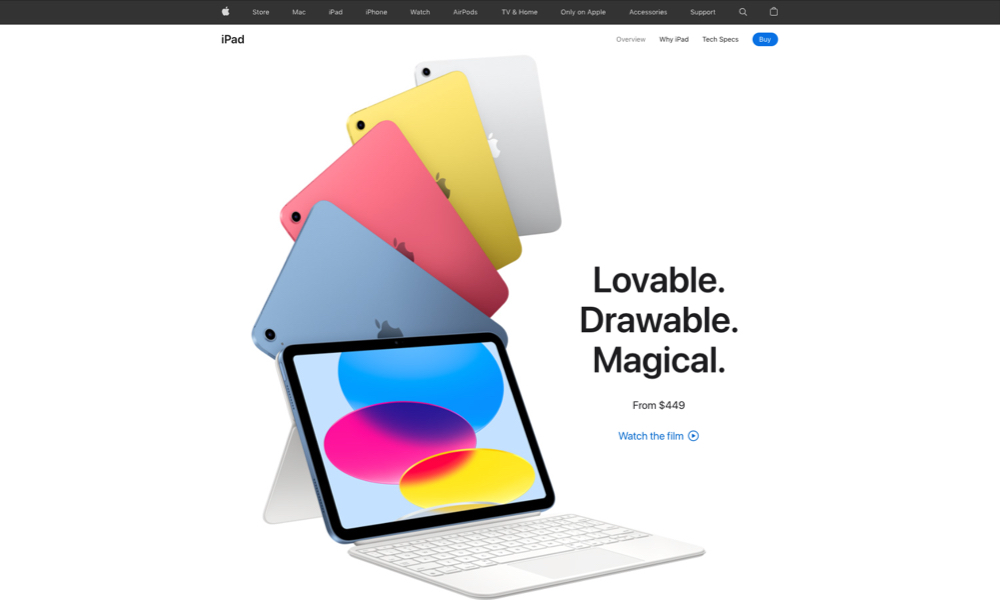
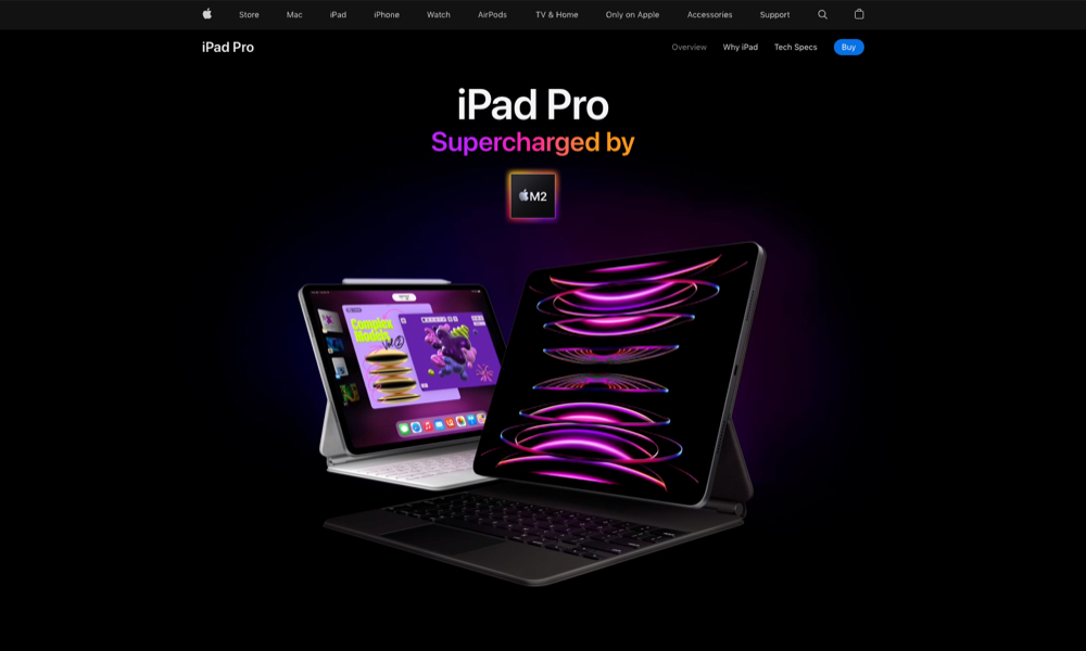
One of the chief purposes of design is to allow for information to be transmitted clearly without obstruction. Good use of white space is one way to bring clarity to information on a page by reducing clutter and allowing the user to process that content easily. Apple executes this beautifully. Deliberate use of white space allows for the user to take in each section with ease. As you scroll down their product pages, generous use of space allows us to focus on the beautiful product shots and at micro level, the spacing around the text allows us to read each description clearly and hone in on the buy buttons
In Gestalt psychology, the Law of Proximity states that objects near each other appear similar. There’s a relationship and a connection between the objects just by how close and far apart they are, and this is made possible by the use of white space. Good use of white space clarifies relationships and brings coherency to information design.
Reduces cognitive load
Remember the old infomercials? The end screen would always be an overload of information filled with promotional prices, payment options, and a sea of fine print. It always looked like a mess. It was an example of cramming information onto a screen and letting the viewer figure out what to look at amidst the chaos. We refer to the work it takes to process that information as cognitive load. Without proper spacing, information becomes cluttered, and tasks become difficult to parse out. Design author Jason Fried, best known for co-founding the popular project management tool Basecamp, touches on this topic, saying: “Obvious is all about always. The thing(s) people do all the time, the always stuff, should be obvious. The core, the epicenter, the essence of the product should be obvious.” Good use of white space makes tasks easier and clearer by reducing design complexity and emphasizing an element or task.

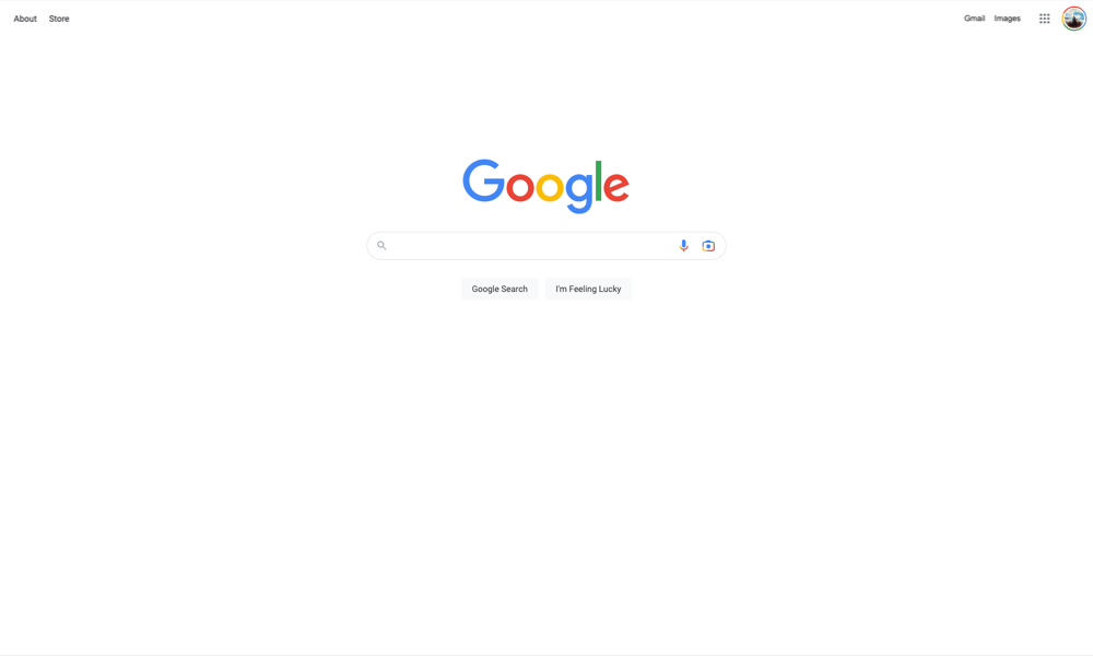
Google is a great example of this. The search bar is front and center. There are no other elements to obstruct your view of the search bar. It’s surrounded by white space which draws your eye directly to the main task. There are no advertisements, content modules, images, or any other elements (besides the occasional Google Doodle) to take you away from the main function of search. In that way, the task of searching is made obvious, and the search bar itself is the main focus due to the white space surrounding it.
Branding
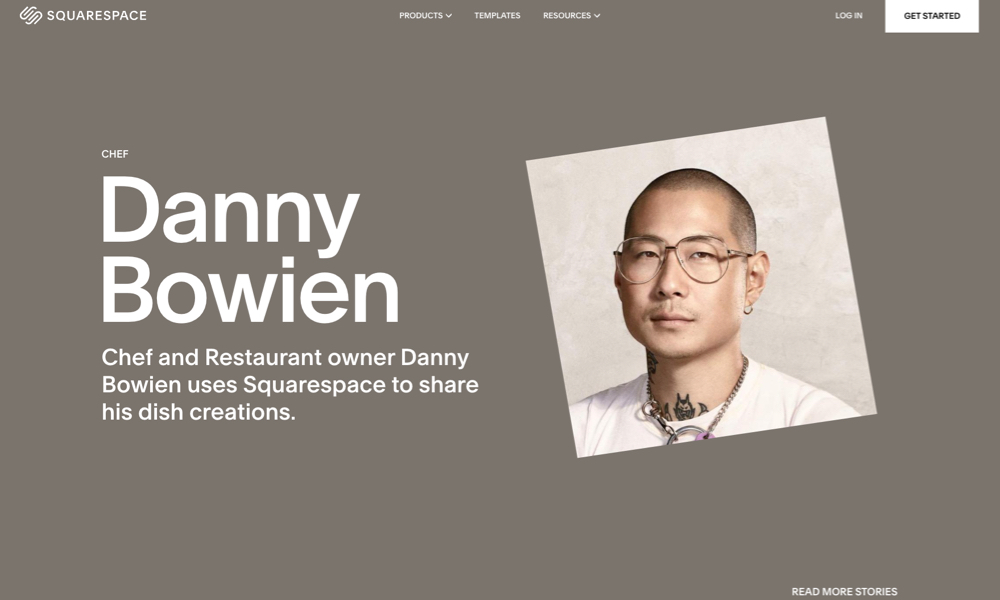
White space enhances the aesthetic of a design and adds character to the brand. Similar to the way musical rests or moments of silence introduce and end measures of a song, white space adds rhythm and voice to a webpage. As you scroll down a webpage, there’s a flow to how one takes in the information being portrayed. There are brief moments when we want users to scan quickly and take in information fast, and then there are moments where we want them to slow down and spend some time processing information. There are loud moments when we want to shout out with large blocks of content, and there are softer moments when we want users to take in a piece of content. The amount of white space implemented around content can add to the overall tone of a website. Squarespace has some great examples of this. One of the characteristics of their websites is the generous amount of white space and focus on content. As you scroll down, there’s a rhythm and a conscious desire to have users experience each section in a unique way. This makes the site feel modern, clean, and engaging – and in the process lends confidence to the brand. The brand doesn’t have to shout loud with an abundance of design elements. The content speaks for itself, and the spacing around each section allows those elements to communicate on their own.
Conclusion
The smart application of white space is a necessity, not a luxury. It’s a tool that, when used properly, can improve your content’s legibility, bring focus and attention to important areas, make tasks easier, and ultimately create experiences for audiences that can leave a positive impression on your brand.
More Insights

Six Design Trends You Will See in 2024
In the field of design, trends come and go. As technologies evolve and user preferences shift, design trends naturally progress and adapt. Keeping up with the latest trends helps brands stay current and resonate more with consumers as their preferences evolve. Last year, we highlighted dynamic color, personalization, and simplicity. In 2024, we envision designers

‘Tis the Season to Commit to Exceptional Experiences: UX Resolutions for 2024
With December upon us, our thoughts turn to resolutions—the ways we can be better in the year to come. For us as an agency, that means constantly raising the bar for ourselves, our clients, our communities, our industry, our families, and our friends. For our UX team, whose job it is to advocate for users,