How to Check Web Accessibility with a Screen Reader and Keyboard


Note, the following is a transcript of the video above adapted for reading. You can access a direct transcript using the captions feature in the video player.
At ExpandTheRoom, we often help audit our client’s websites for compliance with WCAG, which is the web content accessibility guidelines. These guidelines lay out techniques for making accessible websites. People in the web design industry should know how easy and helpful it is to audit the accessibility of the websites we make by using our keyboards and screen readers, so in this article I’ll aim to explain how you can get started.
The Problem with Automated Accessibility Scans
Why use assistive technology yourself when conducting a usability audit? When I first started doing these audits, I would use tools that attempted to scan a website and point out accessibility issues. But I found the issues were abstract and hard to parse. A key user experience design principle is to have empathy for the users who will be using your products and to understand their experience, so I thought that a better way to audit websites for accessibility issues would be to use the websites with the same techniques a disabled user might.
Now, I audit websites by seeing if it’s possible to navigate and complete tasks using a keyboard only as someone with a different level of motor skills might, and with a screen reader, as someone who is visually impaired might. I find using these techniques combined with an understanding of all WCAG guidelines makes the audit process much easier, faster, and more intuitive. Using these techniques allows me to truly understand why the WCAG guidelines are in place instead of making updates to code that I don’t understand.
After making the updates, I can check my work to see if it’s more usable with the assistive technology. Building accessible websites is a goal that all web developers should strive to meet in every web project, because it makes the web more inclusive and usable. It’s always better to develop a website accessibly rather than to use an overlay widget or add on accessibility at the end, like a coat of paint. The Disability Community has spoken out about these tools saying they often make their experiences more difficult instead of helping. And they’re sold to companies as a quick fix to prevent them from being sued. These add-on usability plugins are probably better than nothing, but if the underlying code is not developed accessibly there’s only so much they can do. And that’s not how we should approach the goal of an accessible web.
One more note, before we get into this, using these tools and following these guidelines is not actually that hard, so don’t be intimidated. I think that companies that sell accessibility solutions try to frame accessibility as a black box that’s impossible to understand, but I believe the concepts are not that difficult if we take the time to learn them.
In the video walkthrough, I focus on desktop usage as opposed to mobile. If you meet the WCAG guidelines on desktop, most, if not, all of them will apply to mobile as well. Just keep in mind any elements of your website that are unique to your mobile experience and make sure they’re considered as well.
How to Check Web Accessibility Using a Keyboard
Make sure interactive elements can be used with a keyboard only
So most of us have a keyboard, right? Start by using the tab key to navigate your site. You can use “SHIFT” combined with “TAB” to go backwards. Everything you can click on a site should also be navigable by keyboard. As you navigate, an outline called a focus ring should follow you around, letting you know what element is currently selected. You can change the style of this, but you should not try to get rid of it as it’s essential to know where the focus is as I’m navigating through this site. Keep an eye out for any custom elements that should be focused on tab, but don’t.
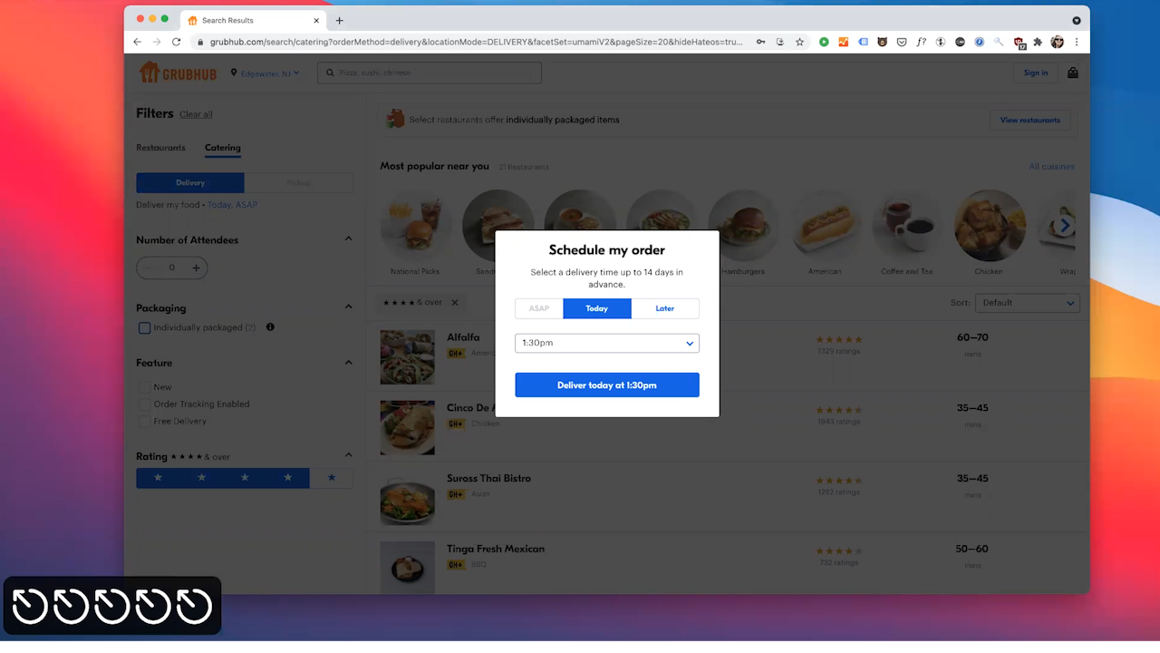
For example, when testing out keyboard navigation on Grubhub.com, I noticed my keyboard was skipping over the location selector, which is a key interactive element that keyboard users wouldn’t be able to access. For custom elements, you might have to manually add focus via the “tab index” in order for them to be focused on. For any interactive elements, make sure you can operate them via keyboard. Some HTML elements like links and buttons will have this keyboard usage built in by default while others you might have to add.
Avoid Keyboard Traps
Make sure to also avoid creating keyboard traps. This happens when an element such as an overlay traps a user if they can’t use a keyboard to get out of it. I see this all the time with popups when I try to press the escape key.
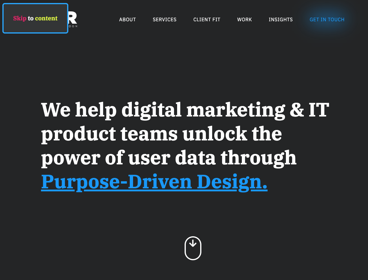
Add a “Skip to Main Content” Button
An often overlooked and helpful keyboard navigation tool is a “skip to main” content button. This button is usually located at the top of the page and hidden unless focused on, making it easy for a keyboard user to access by pressing tab when they load the page. Pressing the “skip to main” content button automatically jumps past all of the typical website header content like navigation and the site logo for easy access to the body of the page.
I won’t go into every keyboard usage guideline in this article, but even just starting to use the keyboard on websites instead of your mouse will quickly show you where the gaps are next up.
How to Check Web Accessibility Using a Screen Reader
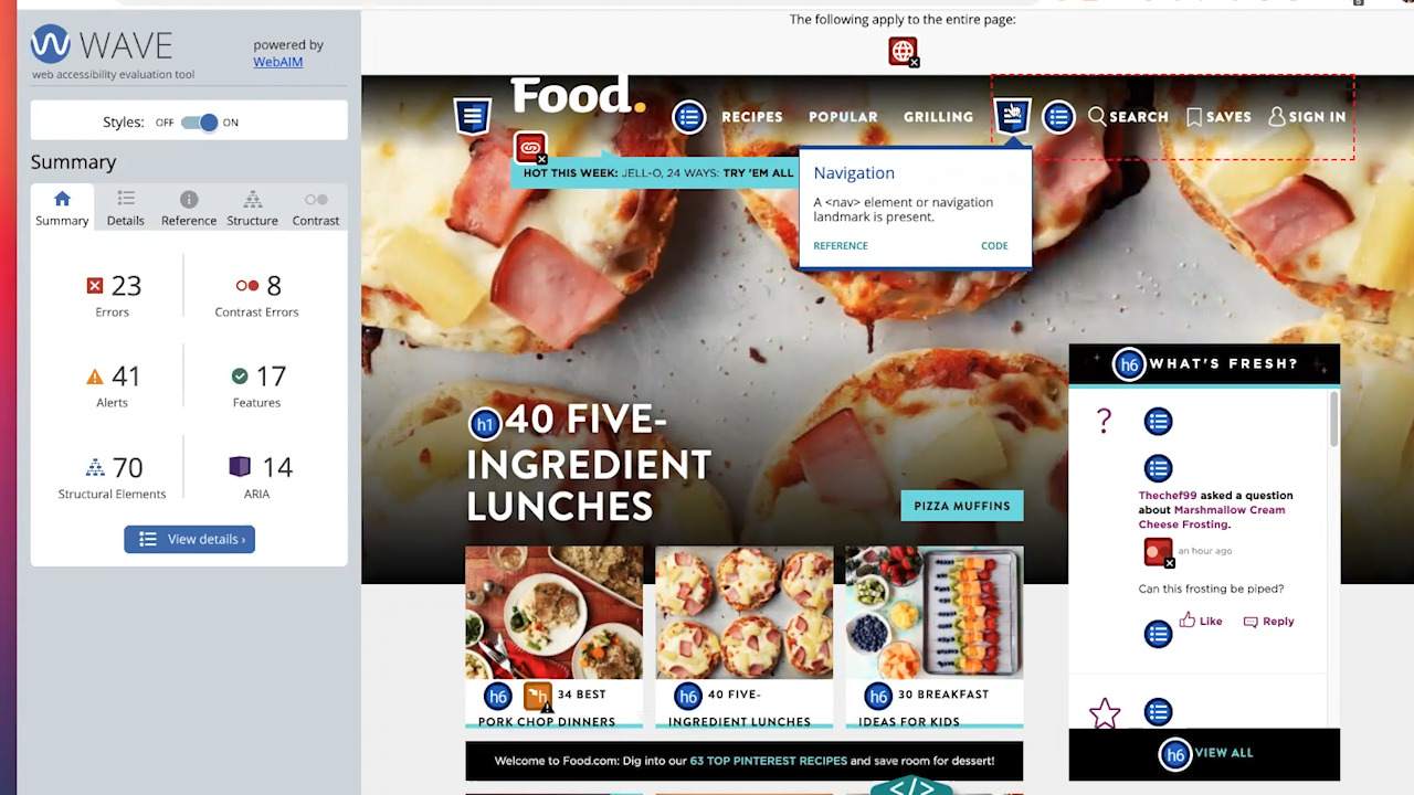
Let’s talk about screen readers. Every year, webaim.org puts out a survey on screen reader usage that I encourage you to check out.
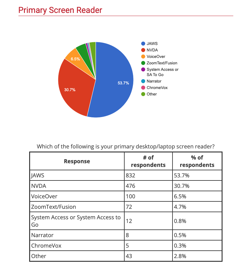
53% of users surveyed use the Jaws screen reader, followed by 30.7% using NVDA and 6.5% using Voiceover. Jaws is a screen reader that must be purchased. NVDA can be downloaded for free on Windows computers, while Voiceover is already built into Macs. I found that both parse websites in a similar way. So if you can pass guidelines with one reader, the site should also pass using another.
Using screen readers allows you to imagine the web experience for someone who is blind or visually impaired. Screen readers on desktops or laptop computers are usually operated via a keyboard, which is why testing to make sure websites are fully keyboard accessible is essential.
With a screen reader, it’s time to listen as you navigate. Look for things like “Are images accurately described via text?”, “Can I figure out what this element is for without visual cues?”
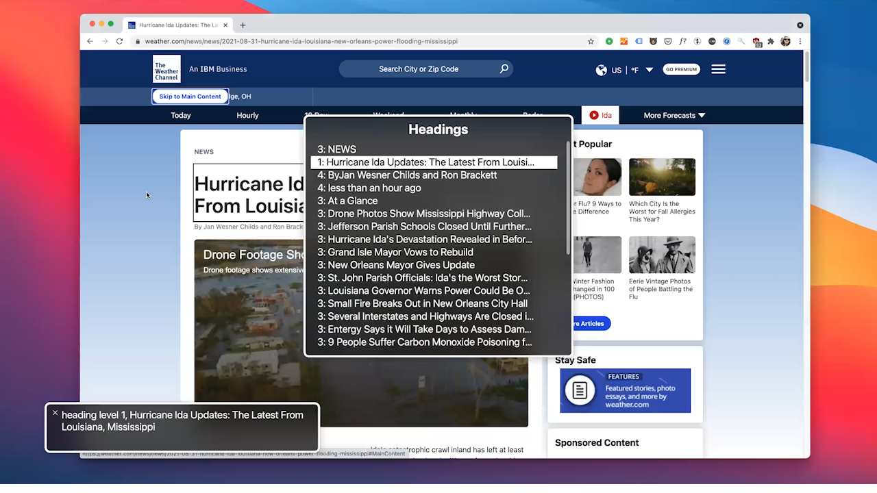
Use Descriptive Header and Link Text
Screen readers have the option to use a menu or rotor to navigate by certain parts of the page, such as by headers, links, or regions. It is very important to make sure the headers are descriptive and in the correct order. You shouldn’t switch from an H4 to an H2 without a structural reason.
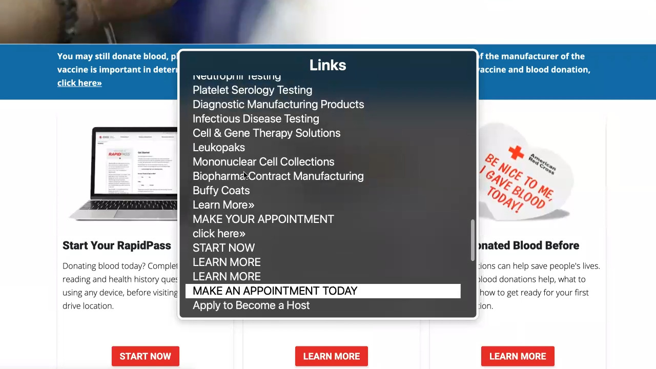
The same rule applies to buttons and links. If you read the text of a link in isolation, would you be able to figure out where it leads? An example of linked text with poor accessibility is a click here link. Without the context of the surrounding text, you have no idea where it will go.
Add ARIA Attributes to Interactive Elements
In addition to these guidelines, there are several components to consider that use ARIA, or accessible rich internet applications. ARIA can be added as HTML attributes that make certain interactive elements accessible, such as indicating when collapsed content like a dropdown or accordion can be opened or helping to identify what element the label is associated with. I won’t go into the details now, but I will provide the links to learn more about ARIA at the end of this article.
When auditing with a screen reader, remember to always think to yourself, “Am I hearing the full context on what this page element is for and how to use it, or is something missing?” If something is missing, look into what labels or ARIA attributes can be added.
This article just scratches the surface of accessibility guidelines that need to be considered in web development, but the main takeaway I want to convey is that using a screen reader and the keyboard really helps you to understand what needs to be considered for accessibility. It’s so much less abstract than using a plugin, and so much less expensive than hiring a tool to do the thinking for you.
Please take a look at the links I’ve included below for further learning, and don’t be afraid to use assistive technology in your process going forward.
ExpandTheRoom might be able to help with your accessible web development needs, contact us today.
More links for further learning
Open letter on Overlay Products
Webaim.org screen reader survey
NVDA (Windows) screenreader download
NVDA (Windows) screenreader controls guide
Voiceover (Mac) controls guide
Blind user Jason Holt demos the JAWS screen reader
Bonus: Screen Reader Only Website – this website is only usable for screen reader users to demonstrate the accessibility challenges many websites pose
Previous video on accessible web development by ExpandTheRoom – https://youtu.be/EKwfHV9C6zo
More Insights
How to Improve the Success Rate of Your Website Content Migration
If your company has a website, there will come a time when you’ll want to redesign or replatform. It’s not a matter of if this will happen, but when. Because in digital nothing stays the same for long. When that happens, you’ll be faced with a content migration: the transfer of your assets (copy, images,


5 Ways We’re Using Artificial Intelligence as a Web Design Agency Right Now
We are testing the many tools powered by A.I. that have arrived recently in order to see how they could help improve our processes.