Best UX Pattern for a Website Navigation With Dropdown Menus
Part 1
The Test Setup
Here at ExpandTheRoom we are constantly designing and reimagining information architectures and website navigation schemes for our clients. There are many different patterns and unique challenges to address with these projects. Those challenges often become a lot more complex than you realize at the surface level.
One question that comes up often is “What is the right way to handle dropdown menus?” It seems simple, but there are many different ways you could tackle this decision —
- Should the top item in the navigation be clickable, or a label only?
- If it is clickable, do we repeat the link in the dropdown menu, or only show it at the top?
- And what about interacting with the dropdown? Should it be triggered on hover or on click?
- What do we do for mobile?
- What about accessibility?
When looking for answers on the internet, I came up short. Top websites across industries seemed to all have a different way of doing things. Any articles that addressed the topic didn’t go as in depth as I wanted and mainly relied on vague “best practices” that differed between articles. I wanted data that provided an answer once and for all, so I conducted the study myself.
In this article, I’ll share the results of a usability study that tested several different iterations of a navigation prototype as well as a survey of top websites and the patterns that they are using.
To conduct the study, I created a navigation prototype in Figma and tested it using the tool Useberry. I recruited participants from the recruiting service Prolific. I’m happy to say I believe the results give us some definitive answers on the true best practices for dropdown menus in navigation.
Variations to Test
First, let’s go over the different variations I decided to test. They all use a simple wireframe prototype for a fictional fitness club website. Each prototype used the same control navigation with minor variables between them. I made sure to make the navigation and the tasks participants need to complete pretty simple so as not to confuse anyone.
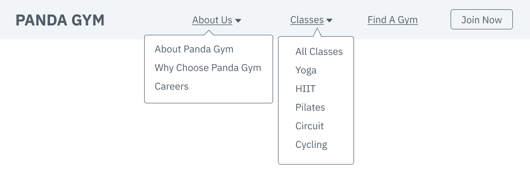
Each participant was asked these four tasks in a random order. Two questions target the top level/overview item, and two questions target items in the sub nav.
- Where would you click to learn more about what this gym is like and its background?
- Answer: About (in version 3 this was called “Overview”)
- Where would you click to read about what makes this gym different and the benefits of joining?
- Answer: About → Why Choose Panda Gym
- Where would you click to learn about the instructor-led programs you can sign up for?
- Answer: Classes (in version 3 this was called “Overview”)
- Where would you click to learn about the gym’s pilates programs?
- Answer: Classes → Pilates
There were three main elements I wanted to test:
- What happens when someone clicks on the top item (or the label that triggers the dropdown opening)?
- What happens when someone hovers on the top item?
- Is it helpful to have some sort of “overview” page that references the top item in the dropdown?
I’ve seen combinations of each of these navigation schemes before, and I wanted to find out which option would perform the best. With Useberry, I was able to have participants complete the study in an unmoderated way to save time and money. I could still watch the sessions later to analyze their mouse movements and clicks in detail. I recruited 50 participants for each version of the test, and my coworkers and I watched and analyzed every session.
| Clicking the top item | Hovering on the top item | Overview page in submenu | |
| Version 1 | Opens menu | Does nothing | Yes – descriptive |
| Version 2 | Takes you to a page | Opens Menu | Yes -descriptive |
| Version 3 | Takes you to a page | Opens Menu | No |
| Version 4 | Does Nothing | Opens Menu | Yes -descriptive |
| Version 5 | Does nothing | Opens Menu | Yes – generic |
While analyzing these sessions, I was looking out for small interactions like:
- Does the participant click the top item when it’s not clickable (Versions 1, 4, and 5)?
- When both a top link and the overview page are present, which do participants use more often (Version 2)?
- Which version ends up having the fastest task completion time?
- Are there any “rage clicks” of extreme frustration? (Rage clicking is the behavior where a user frantically clicks the same link over and over out of frustration.)
With the overview page, I was also curious if a more descriptive label made a difference in comprehension, for example repeating “Learn About Us” instead of something more generic like “Overview,”so I made a version to test this as well.
Part 2
The Outcome
I’ll first share the overall outcome of the tests, and then dive into some juicy takeaways and their implications.
| Average time to complete all tasks (seconds) | Margin of error | |
| Version 1 | 36.78 | +/- 5.63 |
| Version 2 | 31.16 | +/- 4.33 |
| Version 3 | 54.18 | +/- 9.77 |
| Version 4 | 36.04 | +/- 6.79 |
| Version 5 | 36.8 | +/- 6.65 |
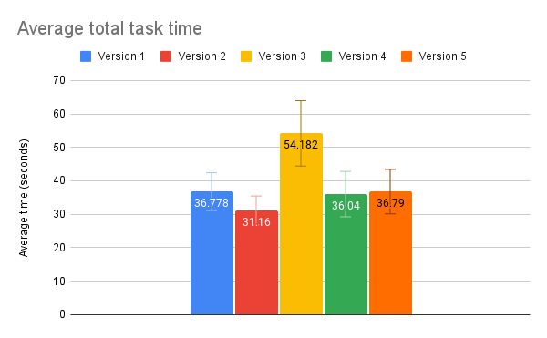
As you can see, a lot of the average total task times ended up being very close, but Version 3, the one where there is no overview page in the submenu, clearly took the greatest amount of time. After analyzing the data, it makes sense why. Version 2 did the best, which also makes sense for reasons I’ll get into soon. I saw no real difference between my two overview labels. It’s interesting to note that the three versions without a clickable top link had nearly the same total task time.
In order to get statistically significant quantitative data, I’d probably have to recruit 10x the number of participants I did. But as a UX designer, I know that quantitative data is a good way to get a sense of the big picture, whereas qualitative data can show you the why and is often where the best insights lie. Next, we’ll dive deeper into what the task recordings and individual task data revealed.
Part 3
Big Takeaways
Here’s a summary of my big takeaways from diving into this data:
- Across versions, participants learned the interaction patterns quickly, and task time dramatically decreased.
- “Information foraging” was smoother and faster with the hover-to-open menu interaction versus the click-to-open interaction.
- Clicking the top menu item was less common than clicking the overview link, but providing an option for both is an advantage.
- The absence of an overview link caused confusion and frustration.
- More descriptive labels are better.
Across versions, participants learned the interaction patterns quickly, and task time dramatically decreased.
Watching all of the individual session recordings, I quickly recognized a pattern across all versions, no matter the task order. On the first task, participants had a slower completion time as they got their bearings and figured out the navigation. Some opened multiple menus hunting for the answer. Then, most flew through the following three tasks.They had learned the unique interface of that design. Internet users are doing this constantly. Every new website is a new puzzle, and through practice we’ve figured out the different possibilities pretty efficiently. But why should that time be spent learning every website separately?
One often-cited rule of interface design is consistency — don’t reinvent the wheel when you don’t have to, as it will slow users down. Instead, rely on standards already set. However, for this particular issue, there really is no standard! At a macro level, the navigations work pretty much the same –horizontal list of links at the top of a page, some with dropdowns of more links. But the details have yet to be agreed upon, costing internet users precious time, which is why I set out to create this study in the first place.

“Information foraging” was smoother and faster with the hover-to-open menu interaction over the click-to-open interaction.
Information foraging is a concept that describes how people find information on the web. When trying to find the location for the information users are seeking, they may open dropdown menus to peek at what is inside of them before making a decision on where to navigate. I saw this behavior across all prototype versions. And what was interesting was the speed difference between the “click-to-open” menu and the “hover-to-open” menu when users foraged for information. It may only amount to mere milliseconds, but continuously clicking menus to hunt for information can get tiring and has a higher cost than hovering, which can add up. Check out these recording clips to get a sense of what I mean.
Because of this, I recommend opening the navigation dropdown menus on hover as opposed to click. There are both mobile design and accessibility implications with this approach to keep in mind, which I will explain towards the end of this article.
Clicking the top menu item was less common than clicking the overview link, but providing an option for both is an advantage.
In Version 2, where participants could access a page either via the top link or an overview link, most participants chose the overview link. This could be because the overview link was the most obvious path, and users have learned that it’s not a guarantee the top item will be clickable. Still, 11 out of the 50 participants did choose to use the top link. In Versions 4 and 5, where clicking the top items did not do anything, 15 participants in each version tried to click the top link. What this tells us is that even if the majority of users know to use the overview link, some may still try to click on the top link and expect an interaction.
Providing multiple ways to complete a task or find information is a useful usability principle. It is also a principle of accessibility. As long as the different methods do not contradict each other, multiple pathways can increase findability and help users with different mental models complete a task. For this reason, I recommend making the top link clickable but also providing an overview page that goes to the same information, so that both of these methods can be utilized.
The absence of an overview link caused confusion and frustration.
There’s strong evidence for why Version 3, in which the top link was clickable but there was no overview link, did the worst in terms of average completion time. The absence of the overview link clearly caused confusion and frustration amongst some users, dramatically increasing their completion time. As we saw in the last takeaway, only a handful of participants thought to click the top link, so when this became the only option, it was easy to overlook. From the first takeaway we learned that users have become adept at discovering and adapting to different patterns, so most eventually did figure out how to use the top link in this version, but not until after a bit of struggling, which of course we want to avoid.
In Version 3, I counted 11 out of 50 users who appeared confused in some way — repeatedly skipping over the right answer and clicking around everywhere, sometimes trying the same link multiple times. Three of those 11 included “rage clicking”. We never want to cause our users this kind of stress over using our product. We don’t want to hide valuable content in plain sight where it will rarely be found. If these participants weren’t agreeing to test our prototype and instead encountered something like this “in the wild” it’s likely they’d just end up giving up and going to a competitor’s site in hopes of getting their needs met elsewhere.
More descriptive labels are better.
The results of the last two Versions, whether a more descriptive label (“All Classes”) or a more generic label, (“Overview”) was a wash – they both pretty much scored the same. But I think this time I actually will rely on best practices to dictate an approach. More context will give users a stronger “information scent” to follow. In the same regard that we want to avoid “Learn more” links in the body of a page in favor of more descriptive link text, we should do the same in the navigation. We shouldn’t rely on the context of the top item to inform where links in the dropdown go. This is bad for accessibility and assistive technology that only reads link text, and also just generally less clear for anyone who is quickly scanning your navigation.
Part 4
The State of Dropdown Navigation on the Web …and the Problems
In addition to the data we collected of participants using our prototype versions, we also collected data on what 100 top websites across the internet with dropdown navigations are doing.
The results were pretty shocking.
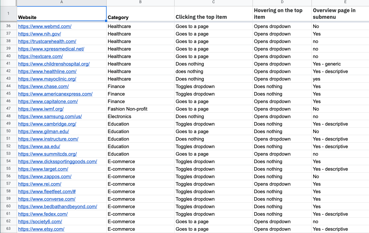
As to be expected, each of the different patterns we tested (and some we didn’t) showed up on these websites, confirming our hypothesis that there is no real consensus on that best pattern to use. What I didn’t expect was that the majority used the pattern that tested the worst. That’s right, Version 3, where the top link is clickable and not relisted in the dropdown, the version that took the most time and caused the most frustration, is the most common pattern on the web. Why, I’m not sure. It might be because content management systems like WordPress make it the default to set up a top item in navigation as a link and repeating it in the navigation is just looked over. Whatever the case, this issue should be addressed since it could be costing these websites lost users and revenue.
| Clicking the top item | Hovering on the top item | Overview page in submenu | % |
| goes to a page | opens dropdown | No | 28.57% |
| goes to a page | opens dropdown | Yes | 25.51% |
| toggles dropdown | Does nothing | Yes | 21.43% |
| does nothing | opens dropdown | no | 8.16% |
| Does Nothing | opens dropdown | Yes | 7.14% |
| toggles dropdown | does nothing | no | 5.10% |
| toggles dropdown | opens dropdown | yes | 2.04% |
| toggles dropdown | opens dropdown | no | 2.04% |
Some websites use the top link as more of a landing page to get to all of the other links listed in the navigation, such as Macy’s. In this case, I understand the reasoning not to repeat the link in the dropdown. But for others, if unique content is being hidden in the top link, it absolutely must be repeated in the dropdown.
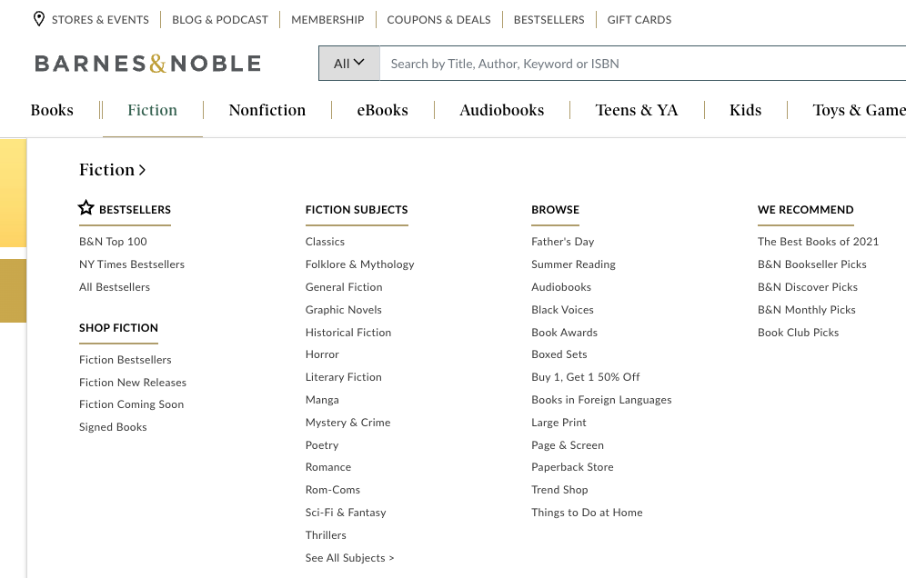
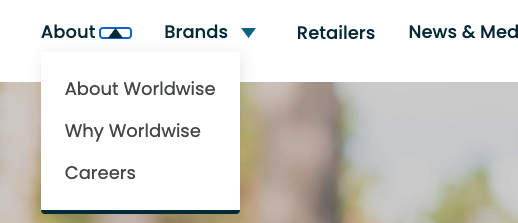
Another bad design decision we saw repeated across sites was the mismatching of styles that made it hard to tell what had a dropdown and what was clickable. In design, it’s important to make sure that interactive elements signify how they can be interacted with, and that unique interactions have unique signifiers. An example of this is how a navigation item with a dropdown menu often has a down arrow. Consistency again plays a factor here. If all of the top item elements have the same interaction and the same style, such as the Barnes and Noble example above, you’re good. The trouble comes when elements with different iterations still have the same style. Take Taboola, for example, which has 3 different menu interactions that all look the same:

This creates frustration from users and prevents them from being able to learn the pattern of your specific website when every link might do something different. This is why it’s important to clearly differentiate interactions, or avoid having different types of interactions when they are not necessary.
Part 5
What to Do About Mobile
“Hover to open the dropdown” and “click the top item to go directly to the overview page” might make sense on desktop, but they quickly fall apart for mobile designs where there is limited space for navigation and hovering is not possible. In order to create an optimal mobile experience, you will need to have some mobile-only interaction rules.
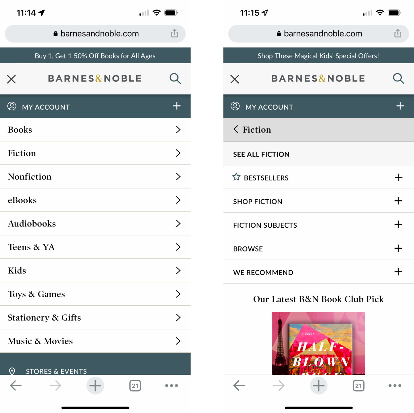
I like how Barnes and Noble does this as well. The menu starts by being contained in a hamburger menu, or the icon that is 3 stacked horizontal lines. This has become a standard mobile navigation indicator, but for the same of accessibility I do still recommend having a “Menu” label to accompany the icon. With the menu open, the top items appear vertically in a stack. Tapping the top item no longer goes directly to the page, but instead opens the dropdown as a submenu. Within the dropdown, a user can still select the overview link to get to the top item page.
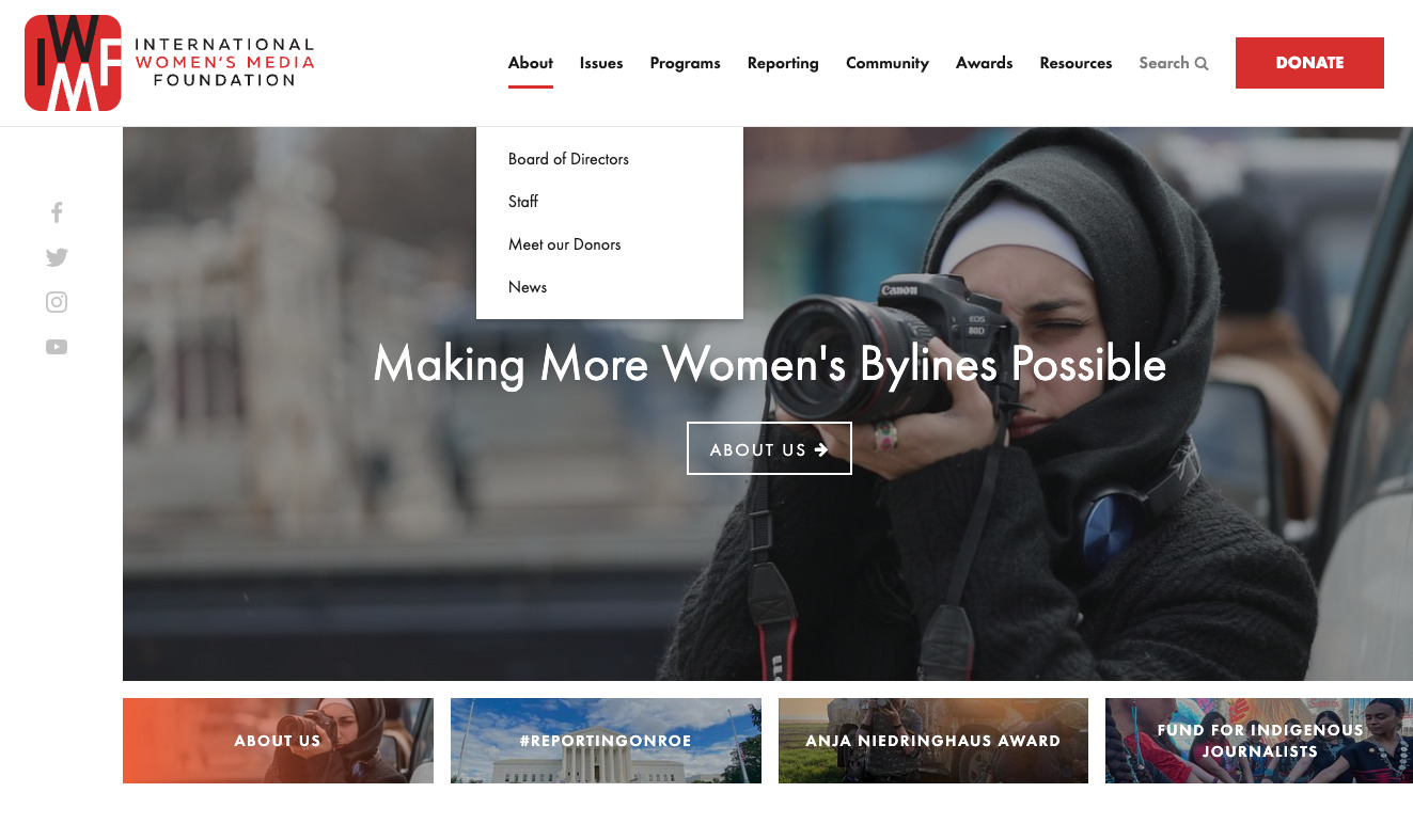
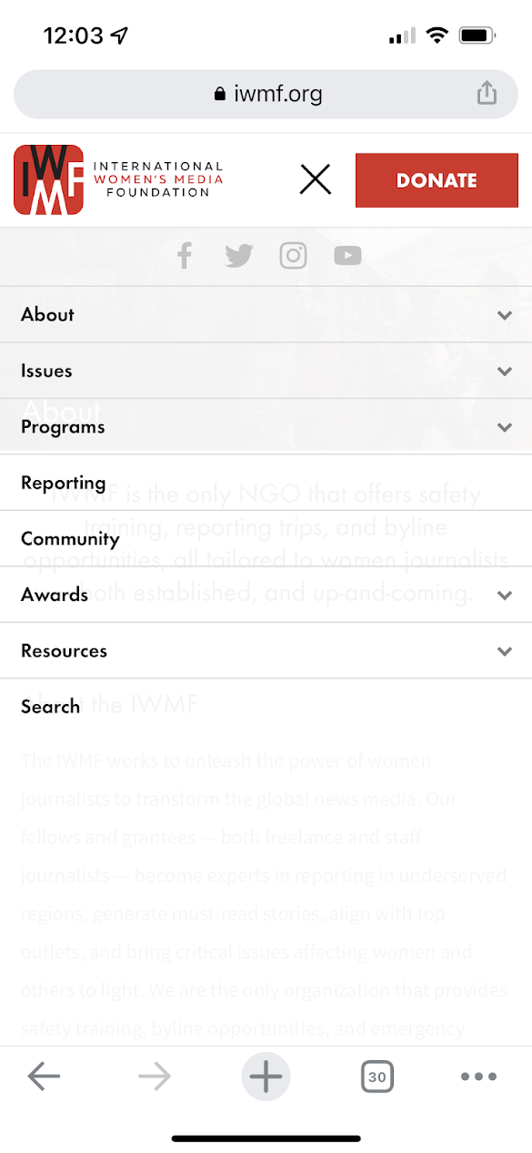
This is another reason why repeating the top link in the dropdown menu is necessary. In the example of International Women’s Media Foundation, tapping on a top item in their mobile menu goes directly to the page, effectively making all of the dropdown items completely inaccessible on mobile. On some sites, designers make it so that tapping the top item text directly goes to the page while tapping the down arrow opens the dropdown. I don’t recommend this approach, as the arrow icon may be too small a click target on mobile. Making sure the dropdown is openable and the top item is still accessible is key for mobile.
Part 6
Don’t Forget About Accessibility
Making the web accessible for everyone is so important and often forgotten, so I wanted to make sure to spend some time talking about how to ensure the navigation pattern we are recommending is accessible.
This means several things:
- The menu is fully usable with only the keyboard.
- The menu items have a visible focus on tab.
- Pressing enter activates the link (behavior that is built-in as long as you are using the link HTML element)
- Dropdowns can be opened and closed with the enter/escape key. When they are opened, it is possible to access the links within the dropdown with the keyboard. When the dropdowns are closed, make sure the dropdown links are not accessible with the keyboard.
- ARIA attributes are used correctly. On the element that opens the dropdown, this includes toggling aria-expanded and making sure aria-haspopup=”true” is set. See an example of this code.
When the top item is also a link, it can’t play the role of both a link that goes to a page and a button that opens the dropdown at the same time. For this reason, I recommend that the element that triggers the opening and closing of the dropdown to be the arrow next to the top level item. Make sure that the arrow has the role button, and the aria attributes mentioned above are applied to it.
Part 7
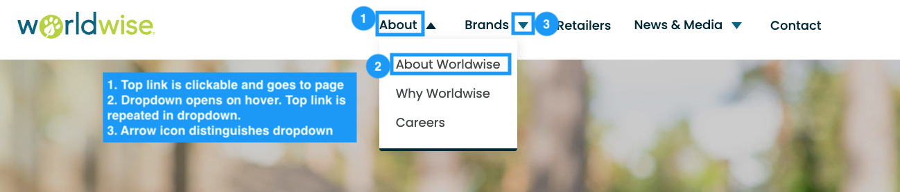
Study Conclusion: The UX Pattern You Should Use
To recap the study’s conclusion, what is the best UX pattern for a website navigation with dropdown menus? I believe the data points to the answer being Version 2; navigations with dropdown menus should make the top link clickable and then repeat that link as a descriptive link in the dropdown menu so that it is not missed by audiences with different mental models of the web. For mobile, when hovering is no longer an option, make the top item open the menu only and rely on the overview link in the submenu to get to the top item page. Make sure that styles are unique for different interaction types, and consider using arrows to indicate when a dropdown exists for accessibility purposes.
I hope this article provided you with some clarity. Of course, as with many things in the world of UX, the true answer is “it depends,” and some websites may call for a unique navigation different from this solution. If your organization could use help designing an effective navigation or running a study to find the answer to a question everyone seems to be asking, consider contacting ExpandTheRoom. Keep an eye out for more studies in the future, and let us know if you found this useful.
—–

Kerrin Whipple is a user experience designer and researcher at ExpandTheRoom, a design and development agency devoted to creating highly effective digital products across a variety of industries including finance, insurance, sports, entertainment, travel, and consumer goods.
Have questions about this article or want to discuss it further? I’d love to connect on LinkedIn.